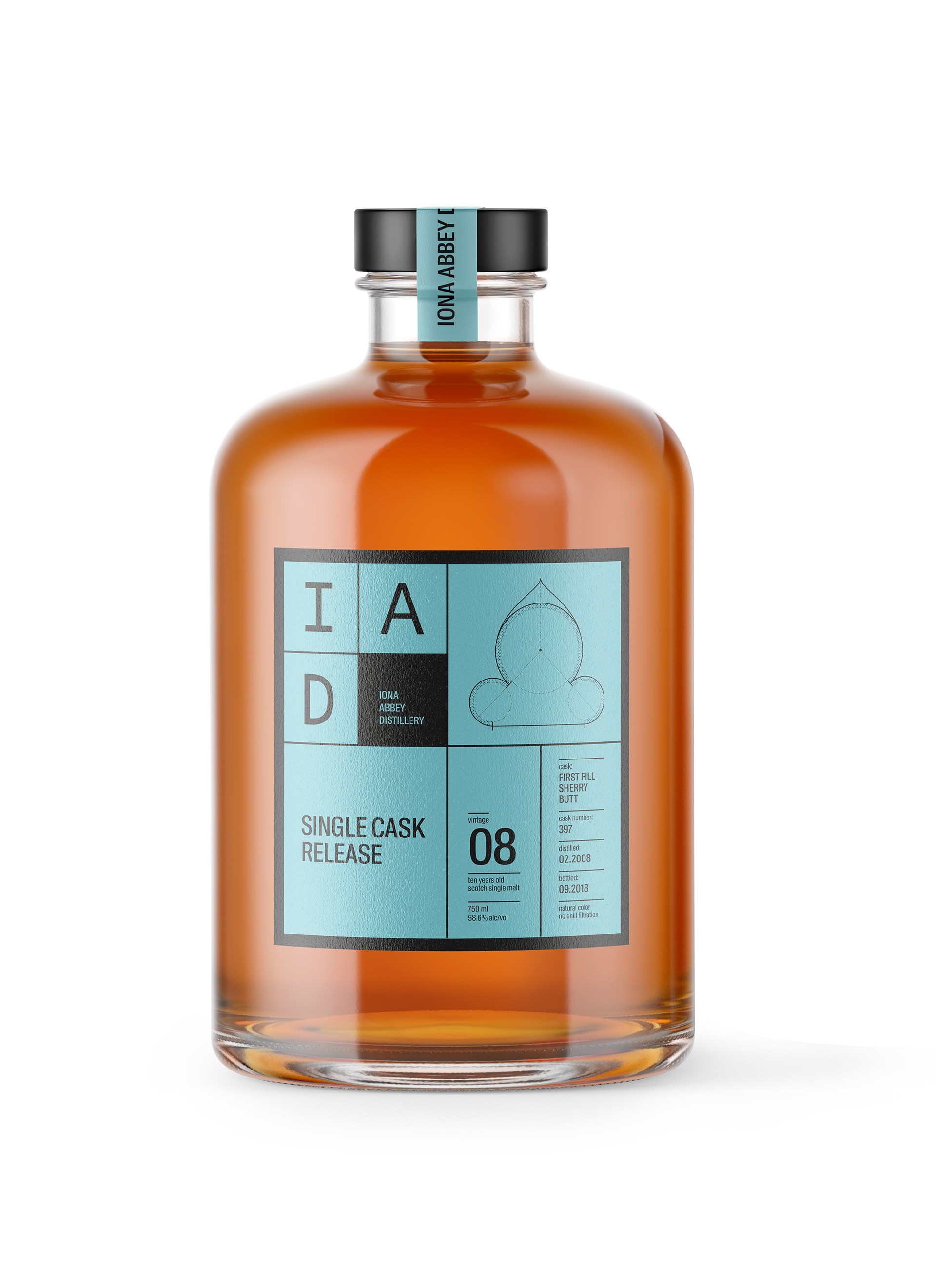
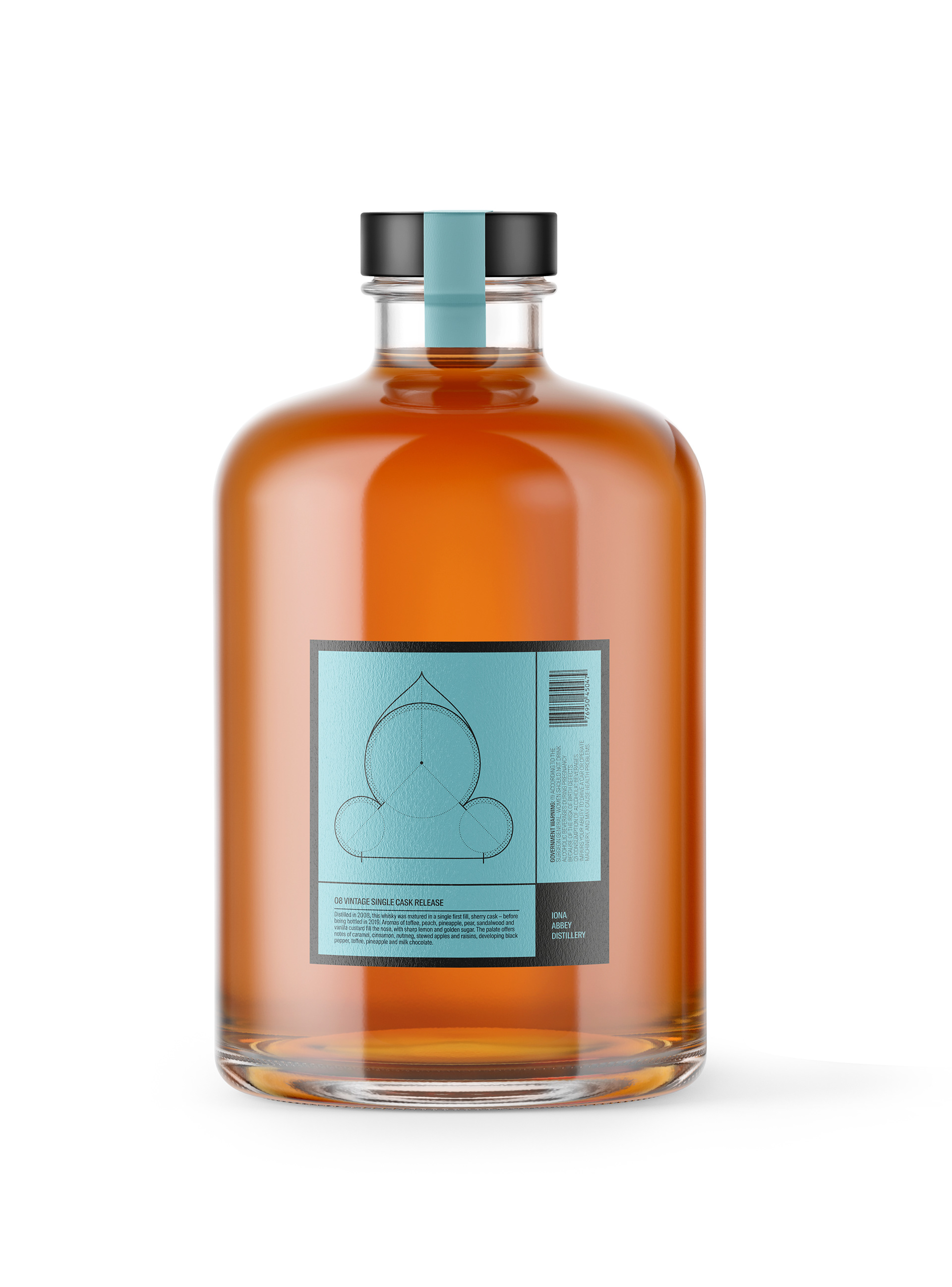
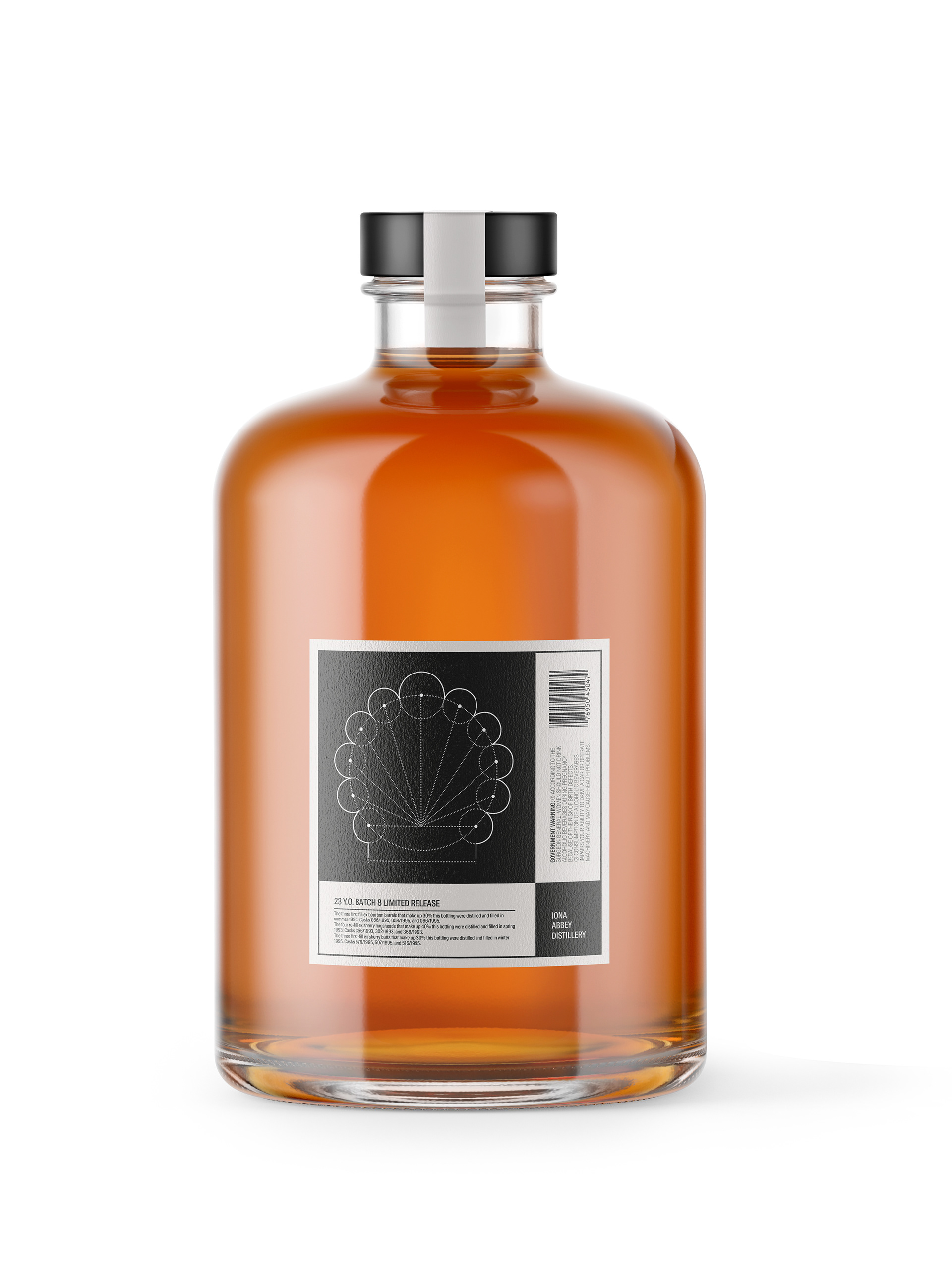
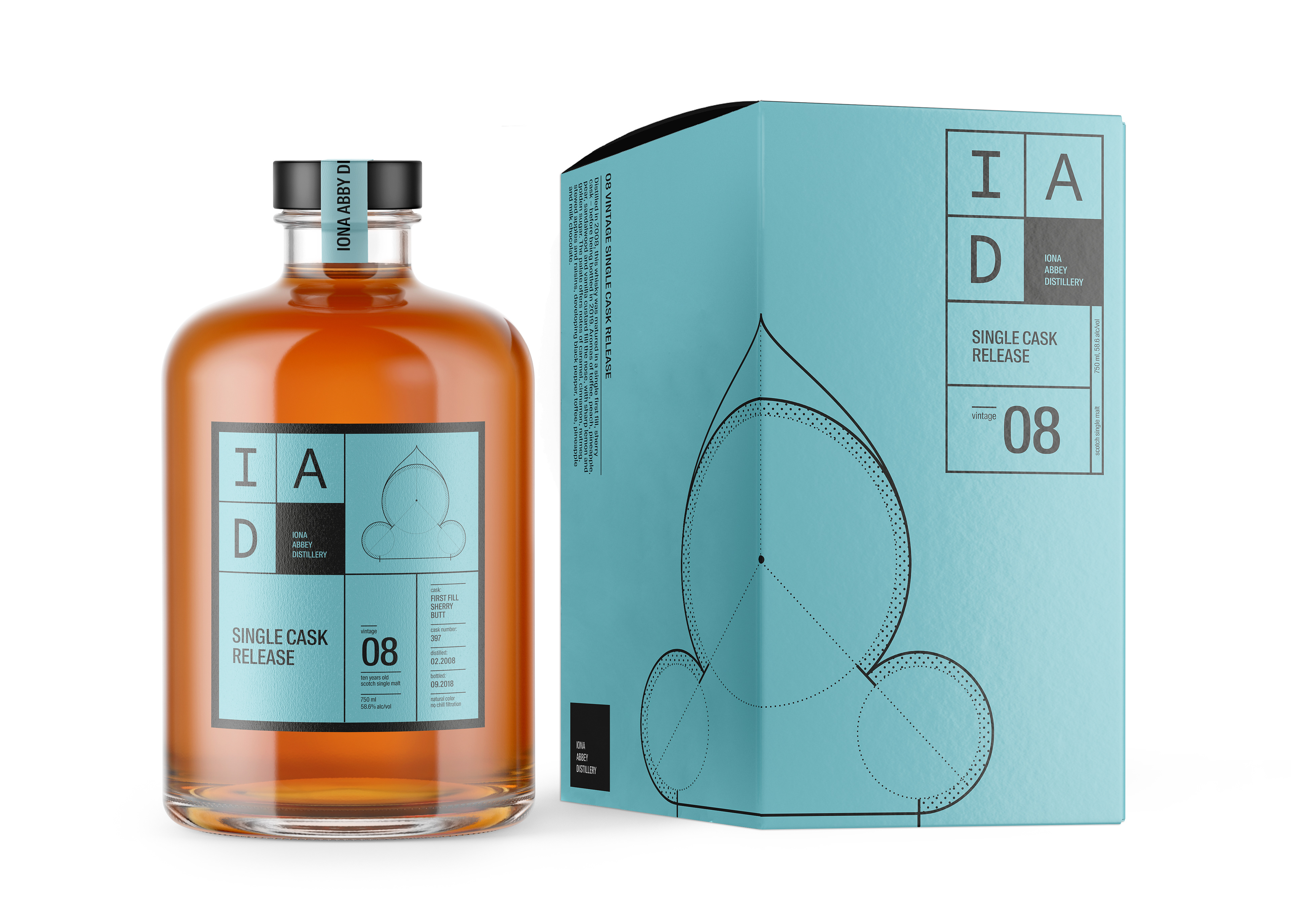
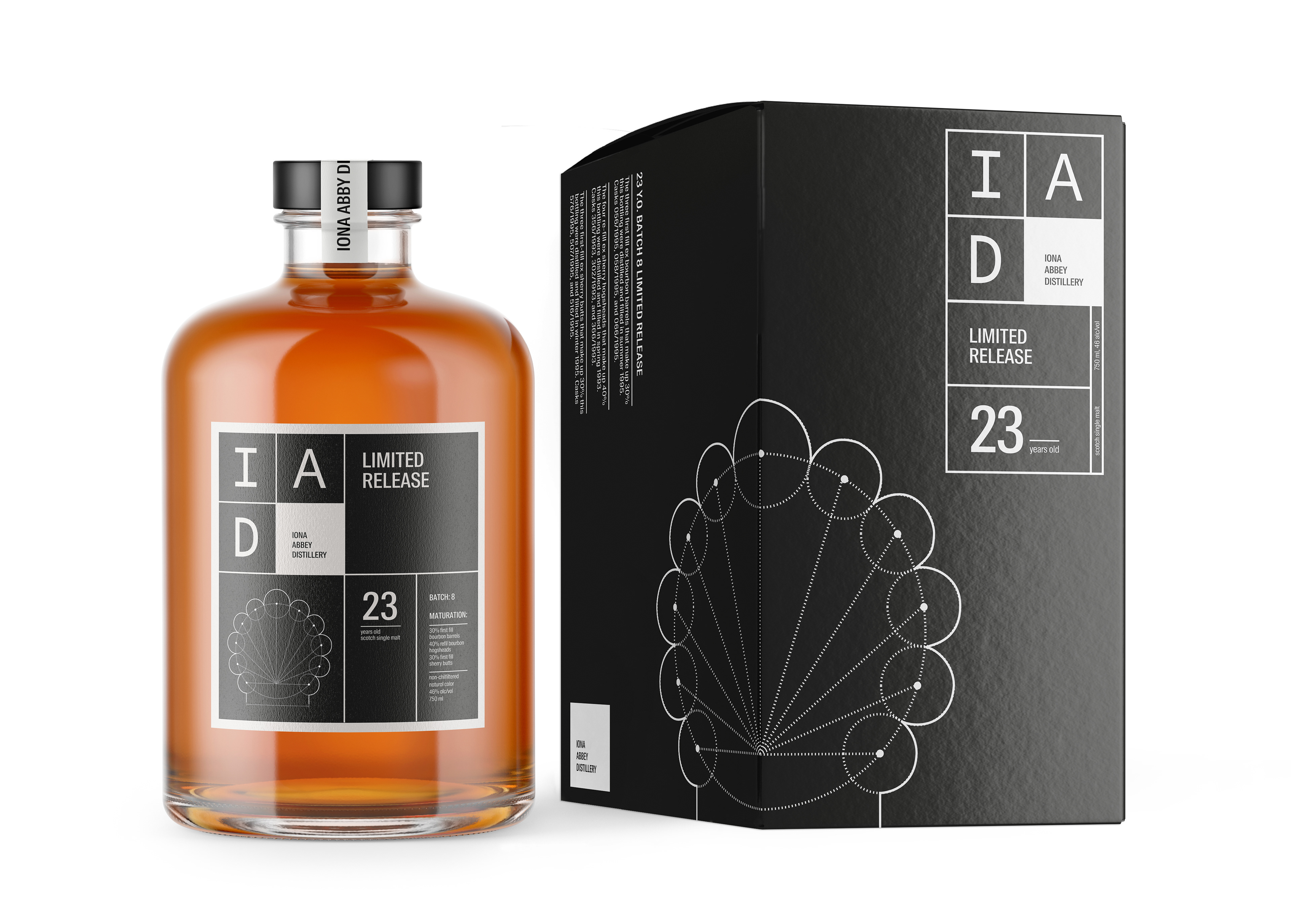
This project is from a school brief to design a brand identity and packaging for an artisan Scottish distillery, that references the distillery's connection to architecture through its founder, an architect and builder.
The design of the visual identity draws inspiration from architectural blueprints
to convey a sense of pragmatism, honesty and straightforwardness in the presentation of the whisky. The identity eschews the clichés often found in traditional whisky marketing and substitutes them with a straightforward, fact based approach to what makes the liquid in the bottle special.
to convey a sense of pragmatism, honesty and straightforwardness in the presentation of the whisky. The identity eschews the clichés often found in traditional whisky marketing and substitutes them with a straightforward, fact based approach to what makes the liquid in the bottle special.
The brand does not have a standard range of whiskies, but rather bottles individual casks and limited release batches of it its single malts, therefore each packaging is accompanied by an individual blue print inspired illustration.
